
Report automation
Excel to PowerPoint: automating recurring reports with VBA
An independent demonstration of how prepared data, validation, and review can turn a recurring update into a more controlled workflow.
Watch the demonstration
Dados preparados no Excel, validação antes da geração e conferência no PowerPoint — sempre com informação fictícia neste exemplo.
The recurring work
The report changes, but the assembly starts over
In many recurring reports, the presentation structure remains while the numbers change. A team updates the spreadsheet, copies values, adjusts charts, and still needs to confirm that every slide reflects the latest version.
The issue is not only assembly time. When source, calculation, and presentation drift apart, an update can look finished before it is consistent. Automation helps when it makes that path clearer for the reviewer.
Before the button
Generation starts with prepared input
In this demonstration, the spreadsheet brings together periods, partners, totals, and validation rules. VBA does not interpret any spreadsheet: it uses a known structure to create a presentation with a summary, trend, partners, and reconciliation.
That boundary is part of the solution. Defined fields and checks before generation help prevent text values or unexpected structures from reaching a report as though they were valid data.
Prepare
Organize the periods, values, and rules the report needs.
Validate
Check the input before generating presentation material.
Generate
Create a new presentation from the structure defined in Excel.
Review
Confirm totals, charts, and management reading before sharing.
A verifiable change
Updating data should appear in the result
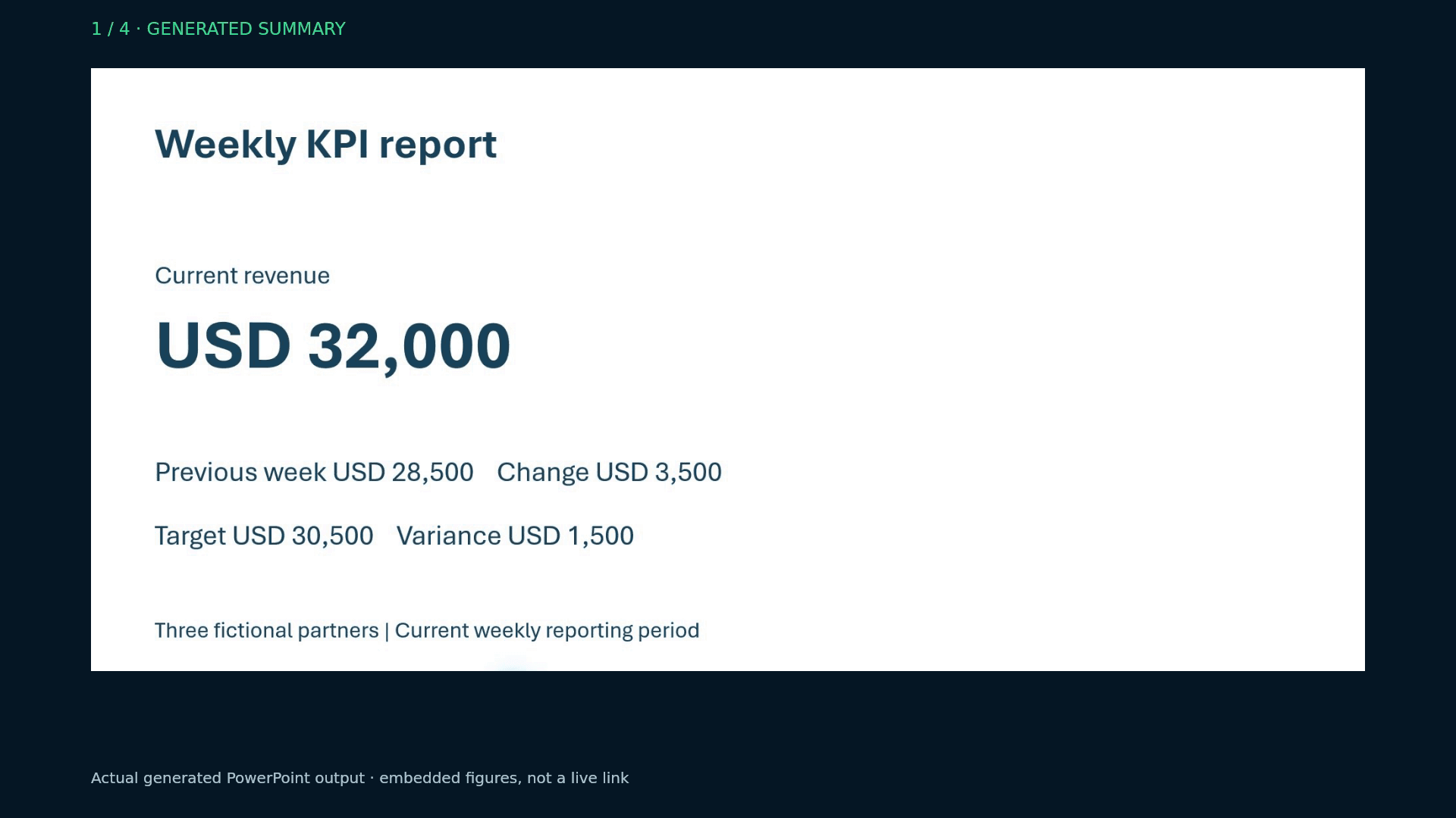
In the test scenario, the fictional Pinewave value changes from USD 12,000 to USD 14,000. The report total changes from USD 30,000 to USD 32,000 when the presentation is generated again.
The relationship between input and output is what matters here. The goal is not to promise that every file can be automated, but to show a workflow where a change can be traced and checked.
Verification
A check that remains legible outside the slide
The values below are the same fictional data used in the final demonstration.
- Pinewave
- ResultUSD 14,000TargetUSD 13,000VarianceUSD 1,000
- HarborLink
- ResultUSD 10,000TargetUSD 9,000VarianceUSD 1,000
- Northfield
- ResultUSD 8,000TargetUSD 8,500Variance−USD 500
- Total
- ResultUSD 32,000TargetUSD 30,500VarianceUSD 1,500
Portfolio demonstration using fictional data. Charts are embedded in the presentation; later spreadsheet changes require a new generation.
Review
Generating does not remove review
The resulting PowerPoint includes two native charts with embedded data and an editable table. After generation, the responsible person still needs to confirm totals, the reading of the indicators, the report message, and its fit for the audience.
In the documented test, a new run without changing the spreadsheet kept the USD 32,000 total and did not accumulate slides. That proves this demonstration scenario, not a universal guarantee for every spreadsheet or workflow.
When it fits
Automation works best when recurrence is clear too
This kind of solution fits reports with a recurring structure, a defined data source, and a known review process. It gives the team a reproducible starting point for generating the presentation and focusing on interpretation.
Unstable sources, many people changing models at once, server execution, or integrations with other systems require a different assessment. The technical path should follow the real process, not force the process into a button.
What this demonstration shows — and what it does not
- Execution on Windows with desktop Excel and PowerPoint.
- Four slides in the example: summary, trend, partners, and reconciliation.
- Data, values, and organizations are entirely fictional.
- It does not demonstrate scheduled execution, Mac, web, email, or integration with other systems.
Common questions
Does the presentation update on its own?
No. After data changes, the presentation is generated again from the prepared structure.
Can charts be edited?
In this scenario, the two charts are native PowerPoint charts with embedded data.
Does it work with any spreadsheet?
Not by default. Automation depends on known input and rules; different files and workflows need assessment.
Which applications were used?
The demonstration was validated on Windows with desktop Excel and PowerPoint.